If done right, UX writing can make the difference between a successful SaaS business and a failed one.
By applying UX writing best practices, your users interact more with the website, app, or online product. It is similar to regular copywriting but with a different focus.
The role of regular copywriters is to inform, educate, and persuade people to buy.
The UX writer, on the other hand, focuses mainly on helping users solve a problem and creating a positive user experience with a digital product.
Concise and engaging UX writing, along with smart UX design, does not only increase your sign-ups, but also encourages your existing customers to keep using your product.
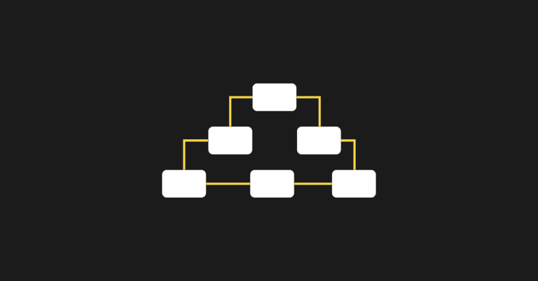
UX writing can include:
● UI copy - helps users understand what to do with the interface.
● Button copy - elicits desired actions and increases conversions.
● Menu copy - makes it easier for users to navigate your site.
● Instructional text – helps users follow the steps while using your software.
● Error messages - helps users troubleshoot any problems they encounter.
So how can you make sure your UX writing is on point?
I offer 7 UX writing tips to help you maximize new sign-ups AND to retain existing users.
1. Know your audience’s biggest pain point
Your customers aren’t buying your software because it’s some shiny new must-have thing. They’re buying it because they have a problem, and they want a solution—now.
They have their own jobs or businesses, and they need to get things done. And they’re struggling to do exactly that. The entire premise of your SaaS product lies in its ability to reduce or eliminate friction within a certain task your customers need to do.
The greater the friction, the greater the pain.
Knowing the exact point of greatest friction (or pain) and how to convey this clearly is the key to the success of your SaaS business.
For example, people don’t just use DocuSign just to digitally sign agreements. People use it to eliminate unnecessary delays in executing agreements. With DocuSign, it can be done in a matter of minutes, not days. The real pain point here is not signing a piece of paper by hand. It is the long and frustrating delays caused by all the back-and-forths between all parties.
Clearly conveying how your software eliminates your customer’s biggest pain point is key to getting people to not only buy your product but also to use it.
2. Focus on the end outcome
Clearly conveying the end outcome for your customers tips their buying decisions in your favor. This should actually be included in the headline or tagline of your home page copy.
Don’t waste time talking about every little feature of your product. The last thing you want is to distract your readers with irrelevant tangents that muddle their thought process while solving their problems.
If the core function of your software helps your customer reach the desired outcome, you’re already more than halfway there. You just need to convey that clearly (more on that later).
Next, you also want to focus on your own outcome:
Acquiring a new customer!
When you have website visitors, you want them to take action. To get them to take action, you need to make them an offer they cannot refuse.
To word your offer in a way that maximizes signups, start with the objective rather than the action itself. For example, instead of writing your call to action as “sign up for a free trial”, write: “For a free trial, sign up here.”
You’re also better off using specific calls to action such as:
● Sign Up Now
● Request Free Trial
● Download Case Study
These have proven much more effective than vague ones like ‘Submit’ or ‘Send’.
3. Simplify your language
Can a ten-year-old kid read your website and understand what it’s about?
If not, you may want to simplify your language. More importantly, make your calls to action stand out more using strong color contrasts and large font sizes.
One great way to do that is to break up large blocks of text into digestible bite-size pieces. Be as minimalist as possible. Avoid jargon. Use small words whenever possible.
The key is to make it easy for them to flow through your pages without getting confused.
Another problem with giving too much information upfront is that it may overwhelm the reader to the point of “paralysis analysis”, which prevents them from taking the desired action. The best approach is to use simple language while giving just enough information for the reader to make a decision.
You can always save the additional information for later, and only give it to them after they engage. For example, you can put that in a drip email series that begins once they sign up, or within how-to guides that help them use your software.
4. Eliminate unnecessary friction
While it helps to have a super-clear CTA, I see a common mistake that many SaaS providers make. They ask readers to fill out endless forms and to cough up their personal information while signing up.
Personally, I can’t count the number of times I closed the tab when it asked me for my credit card number when I tried signing up for a free trial. Here’s my thought process:
“Why should I give my credit card and personal information just for a free trial? If I like the product and want to buy it, only then I’ll send my credit card number.”
Sound familiar?
By eliminating forms asking for unnecessary details for a free trial, you make it easier to acquire customers because once they see the value in your product, the easier it is for them to trust you with their personal information.
Also, design matters! Which brings me to my next point.
5. Review your copy in context
Once you have your copy written, don’t just review it in a Word document. Try it out on the website with the full design. This often requires deeper collaboration with UX designers than with regular copywriting.
Test it on both desktop and mobile devices.
First, fix any glaring errors with mobile responsiveness.
Second, drill down into the finer details. Judge the UX copy critically against the page design.
Take a holistic look at both text and design. Is there synergy between both of these? In other words, does everything seem to “click”?
I’m harping on this because visuals matter, simply because human beings are visual creatures. Graphics, color coordination, and contrast all help words on a page come alive.
6. Be personable
The robots have been taking over our world! Do you think a world dominated by robots will be warm and friendly?
No?
So, don’t write like a robot. Buck the unfortunate trend—be warm and friendly.
Don’t forget to be a little playful, but don’t overdo it. When writing UX copy, be careful with humor. In fact, it’s probably better to avoid it entirely because humor does not always translate well to different cultures.
Instead, write as if you’re helping your sweet grandma through the process.
7. Test your copy by observing user behavior
No, I’m not talking about A/B testing (but you can do that, too, if you want).
I’m talking about sitting a person in front of your SaaS website and watching what they do.
You’ve obviously worked hard on your SaaS website, but until you watch a live person interact with it without interference, you will never know whether your visitors follow your processes exactly as envisioned.
Grab a friend, sit him down, and show him your website. Watch over his shoulder and observe.
● What do they read first?
● What do they gloss over?
● Is he drawn to certain parts, while ignoring others?
● Can he find the CTA quickly and easily?
● Did he try to click on a non-link thinking it was a link?
● Does he get stuck or confused during any process?
It’s not just during the signup process you need to look at.
Can your recently-onboarded customer easily figure out how to use your software, or does he spend more time reading the user guide and getting frustrated? This will also show you whether or not you have a customer retention problem.
Remember, it’s not just about getting more sign ups. It’s also about getting your existing customers to continue using your product.
Watching how a few potential customers interact with your website, both before and after the sign-up process, tells you a lot more than any analytics report would. It is likely that you’ll see a few things to fix that you had not even thought of.
Conclusion
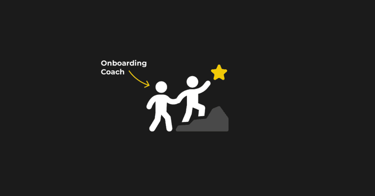
Apart from knowing how your SaaS product solves your prospect’s biggest pain point, it helps to map out each process on your website. For example, your onboarding process may have a few steps.
On each step, the prospect should be clear on 1) what to do, 2) what the next step is, and 3) what the end outcome is. The same goes for people using your product after they purchase it.
The best way to do that is to write in simple language, eliminate any friction, and guide your users to the end outcome that they want.
Finally, it pays to have someone test your site by reading it and following through all the steps defined in your process to make sure they don’t get confused.